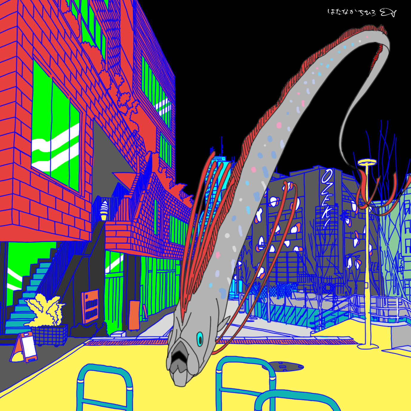
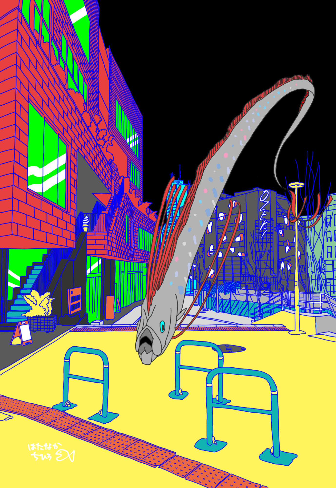
気付いたら下北沢のオオゼキがリニューアルオープンしていた。
前はたしか赤い外観の、ザ・スーパーマーケットといった雰囲気だったけど、何やら黒地に白と赤の模様があしらわれた、よくわからない外観になっていた。
何か意味があるんだろうな。
きっとオオゼキの「O」をデザインした、とかなんだろうな、などと思いながら、日々、横目で素通りしている。
オオゼキさん安いし、いつもお世話になってます。
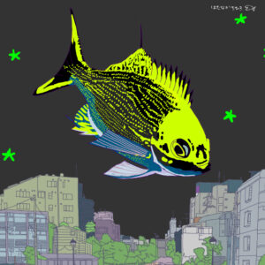
下北沢のオオゼキを眺めていて、ふと、これはリュウグウノツカイだなと思った。
外観の赤と白が、アカマンボウ目の、深海に泳ぐお魚たちに見えたからだ。
その中でも有名なリュウグウノツカイは、広くなった下北沢の駅前広場を悠々と泳ぐのに、とてもふさわしい。
そんなわけでヒラヒラしたリュウグウノツカイを描きました。
色塗りもどんどん主張が強くなって、個性の飛び抜けた下北沢に似合うイラストになったかなと思う。
I noticed that Ozeki in Shimokitazawa had reopened after a renovation.
The previous OZEKI had a red exterior with the atmosphere of a supermarket, but now it has a black background with a white and red pattern, an appearance that I do not understand.
There must be a meaning to it.
I am sure they designed the "O" of OZEKI or something, but I just pass by it every day with a sideways glance.
OZEKI is cheap and I am always grateful to them.
As I was looking at the OZEKI store in Shimokitazawa, I suddenly thought that this was the "OZEKI" of the Japanese giant squid.
The red and white color of the exterior of the building made it look like fish swimming in the deep sea, of the order of the red sunfish.
The famous long-necked skate, one of the most famous fish in the world, is very suitable for swimming leisurely in the wide open space in front of Shimokitazawa station.
That is why I painted the fluttering Longfin Reef Skink.
The coloring became more and more assertive, and I think it became an illustration that fits Shimokitazawa, a place with a lot of individuality.
SPOT